Creating Dynamic Geographic Visualizations with Folium
Written on
Chapter 1: Introduction to Data Visualization
Data visualization often takes a back seat in the realm of data science. While techniques like machine learning and statistical analysis are crucial, the ability to visually represent data—especially geographic data—plays a vital role in effective data storytelling. Many beginner courses in data science introduce fundamental plotting techniques using libraries like matplotlib and seaborn, but they frequently overlook the visualization of geographic data.
Folium is a Python library that leverages Leaflet.js along with Open Street Map data to create high-quality interactive map visualizations. This article will guide you through the process of utilizing Folium to generate engaging map visualizations.
Installation
To begin, you can easily install Folium using pip:
pip install folium
Import Libraries
Before diving into the code, let’s import Folium along with any other necessary libraries. You can find the complete code for this tutorial on GitHub.
import numpy as np
import pandas as pd
import folium
Plotting a Default World Map
Folium includes a Map function, which can be called without any arguments to produce a default world map.
folium.Map()
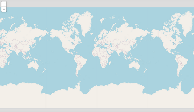
You'll notice that the default map features zoom controls in the top left corner, allowing users to interact with the map and focus on specific areas as needed.
Centering Maps Around Specific Locations
You can center a map on a specific location by providing a list of coordinates to the location parameter in the Map function. For instance, the following code creates a map centered on Tampa, Florida:
folium.Map(location=[27.950575, -82.457176])
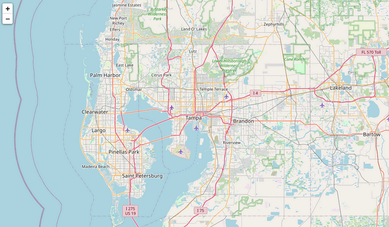
Changing the Map Tiles
You can customize the appearance of your map by changing the tiles with the tiles argument. Here’s how to use the Stamen Toner tiles:
folium.Map(location=[27.950575, -82.457176], tiles="Stamen Toner")
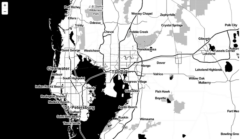
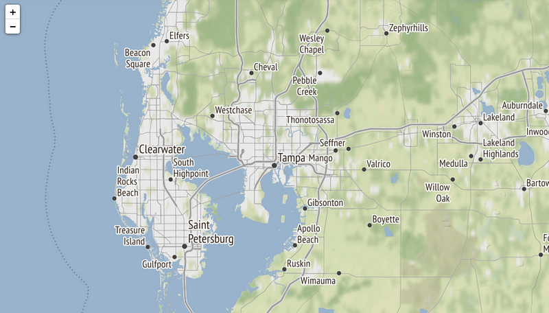
This modification transforms the Tampa map into a black-and-white representation. You can also create terrain maps, as shown below:
folium.Map(location=[27.950575, -82.457176], tiles="Stamen Terrain")
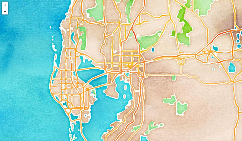
For a more artistic touch, you can generate a watercolor map using Stamen tiles:
folium.Map(location=[27.950575, -82.457176], tiles="Stamen Watercolor")
Adding Markers to the Map
To enhance your map with specific points of interest, you can utilize the Marker class from Folium. Below is an example of how to add markers to a map:
m = folium.Map(location=[27.950575, -82.457176], tiles="Stamen Terrain")
folium.Marker(
location=[27.9658533, -82.8001026],
popup="Clearwater",
icon=folium.Icon(icon="cloud")
).add_to(m)
folium.Marker(
location=[27.773082733154297, -82.64020538330078],
popup="St. Petersburg",
icon=folium.Icon(color='green')
).add_to(m)
m
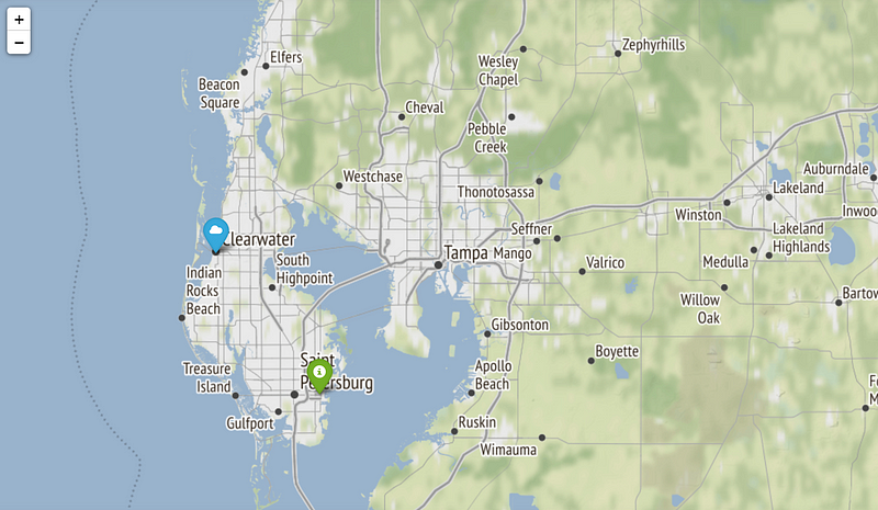
In the map above, markers have been placed for Clearwater and St. Petersburg.
Creating a Choropleth Map
In addition to basic map features, Folium allows you to visualize data and trends using choropleth maps. This section will demonstrate how to create a choropleth map using U.S. unemployment data.
Reading the Data
We will utilize a dataset available in the examples directory of the Folium GitHub repository. This includes a CSV file with unemployment statistics for each state in October 2012, along with a GeoJSON file for map generation.
state_geo = f"{url}/us-states.json"
state_unemployment = f"{url}/US_Unemployment_Oct2012.csv"
state_data = pd.read_csv(state_unemployment)
state_data.head(10)
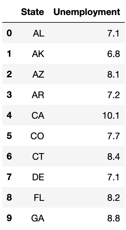
The image above illustrates the first ten entries of the unemployment dataset, displayed using the pandas head function.
Generating the Choropleth Map
With the unemployment data ready, we can now generate a choropleth map by supplying the necessary parameters to the Choropleth constructor:
m = folium.Map(location=[46, -102], zoom_start=3)
folium.Choropleth(
geo_data=state_geo,
name="choropleth map",
data=state_data,
columns=["State", "Unemployment"],
key_on="feature.id",
fill_color="Reds",
fill_opacity=0.7,
line_opacity=0.2,
legend_name="Unemployment Rate (%)",
).add_to(m)
folium.LayerControl().add_to(m)
m
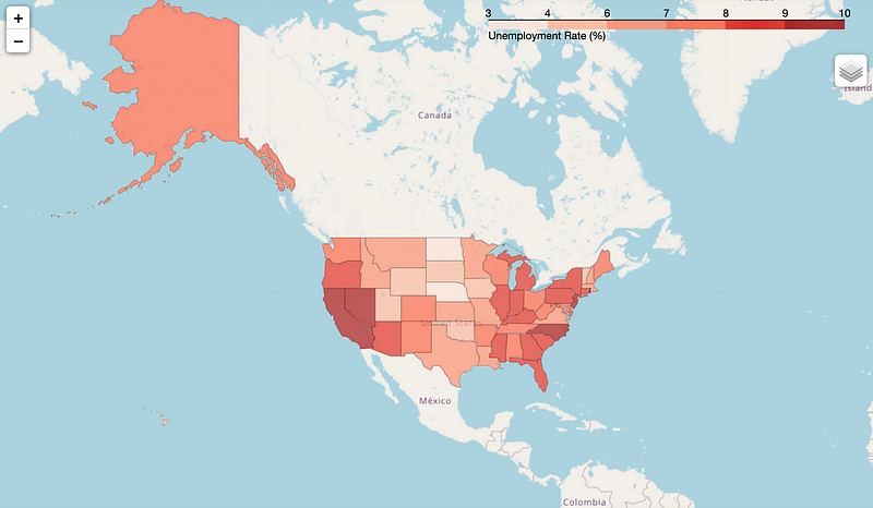
As shown above, we successfully created a choropleth map visualizing the unemployment rates across U.S. states.
Saving the Map as an HTML File
Additionally, you can save your maps as HTML files, which is useful for embedding Folium maps in web applications:
m.save('choropleth_unemployment.html')
Summary
Folium is a powerful tool for visualizing geographic data in Python. It enables users to create interactive maps that can be saved as HTML files and integrated into web applications. This article has only touched upon some of the essential features of Folium; for more comprehensive information, be sure to check out the Folium documentation. You can also access all the code used in this tutorial on GitHub.
Join my Mailing List
Subscribe to my mailing list for updates on my data science content. When you sign up, you'll receive my free Step-By-Step Guide to Solving Machine Learning Problems! Additionally, you can follow me on Twitter for further updates. Don't forget to consider joining the Medium community to explore articles by countless other writers.
Sources
Rob Story, Folium 0.14.0 documentation, (2013), GitHub.
This video tutorial on creating interactive maps using Folium in Python provides a comprehensive guide to understanding the library and its capabilities.
Learn to create interactive maps in Jupyter Notebooks with Folium in this informative video tutorial, which covers various map types and customization options.